
Graphics for Video & DVD
This article was written by Alistair Jackson of EditHouse, and was first published in Digital Media World magazine in November 2002.
Please note that some of the content in this article is no longer relevant. In particular, interlace flicker is rarely a problem with current display technologies.
The convergence of television and computer technology has not only led to the huge increase in the use of desktop computers for video post-production, but also to a proliferation of computer trained graphic artists redirecting their skills to the television industry. This development has been accentuated by the decline in dot com companies, with more than a few web designers turning their attention to television, and in particular the new field of DVD design.
DVD has a definite IT feel to it. You have menus, slide shows, scripting and even a CD like disc. However, there is one very big difference. A DVD will most commonly be displayed on a television set, and for many years to come this is going to be the Cathode Ray Tube variety that dominates the average lounge room. Not only does this effect the way people use the medium (you can slouch around with a group of friends, a beer in one hand and a remote control in the other, as opposed to leaning shoulder to shoulder around a computer on a desk), but it adds a host of design issues that must be considered.
Apart from failing to pay sufficient attention to audio quality, the next most common mistakes people new to television make are with the title safe area and with interlace flicker. These are concepts that are unique to television display technology, and must be accounted for if your product is going to be viewed on a TV.
ACTION SAFE AND TITLE SAFE
For various historical reasons, a broadcast video picture looses the outer sides of the image under the edge of the television screen. So, even though a PAL video picture is digitised as 720 pixels wide by 576 high, your average television set will only display approximately 650 by 520 of these! Where this becomes problematic is that computer displays and many data projectors will show all the pixels, but the older a television, the less it will show. This means that when creating DVD menus (or any television content), you have to allow for the fact that some people will be able to see the whole image, but in some cases, the picture will be as small as the middle 580 by 460 pixels.
Action safe is the location which will be visible on all modern television sets, and therefore you should limit your critical screen images to this area. Title safe is the area that will definitely appear on a screen and wont be too effected by distortions that can happen near the edges.
When preparing menus for a DVD it is vitally important, that you not only make sure that your text occurs within the title safe region, but that it also looks visually pleasing when limited to this region. Rather than just making sure that your text is in the right area, actually create a PhotoShop layer as a mask so that you can see the effect of the missing edges.
INTERLACE FLICKER
Standard television and computer screens create the appearance of a two dimensional image by drawing lines across the screen, starting in the top left corner and making their way down. The human eye is happy to interpret this as a 2 dimensional image, so long as the lines are drawn quickly enough.
If it takes more than a 50th of a second from the time the display device starts drawing its fist line from the top left to the time it finishes in the bottom right, then humans will notice a definite flicker on the screen. So a display device must be refreshed at least 50 times a second. However, to give a sufficient sense of motion on the screen it is only necessary to have 25 pictures per second. So sending 50 is using twice the data you actually require.
The solution to this is an interlaced screen. A television signal draws all the odd lines in an image first (line 1, then 3, then 5, etc), thus getting from top to bottom in one 50th of a second. It then starts the beam up in the top left again and draws all the even lines, thus completing the whole picture in one 25th of a second. This is of course a form of compression, which is what TV is all about - how to get a representation of reality through a transfer medium of limited bandwidth.
Understanding interlaced pictures answers three common television questions. (1) Why is PAL generally referred to as a 50Hz system, when it only shows 25 pictures a second? (2) If I take a screen grab from some video footage that contains motion, why do the edges have a comb like appearance? (3) Why do graphics which contain fine horizontal lines appear to flicker when displayed on a television set?
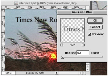
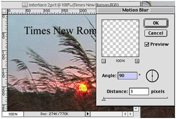
Flicker is caused by high contrast thin horizontal lines. The problem is that the lines are only present on one scan line, so they are only going to be refreshed once every twenty-fifth of a second. To the human eye, this slow refresh rate is very noticeable as flicker. The larger the contrast range between the foreground and the background, the more obvious the flicker. Thus black serif fonts (such as Times New Roman) on a white background, or vice versa, will generally look appalling.
If your graphic material has to contain fine detail, then the easiest way to limit the resulting flicker is to blur the image. While taking a lovely clean graphic and blurring it sounds like a crime, it will actually result in a far less objectionable television image. Depending on your material, a Gaussian Blur of between 0.4 and 0.8 or a vertical motion blur of one pixel will work best.
BROADCAST COLOURS
Two other television issues that should be understood, although aren't quite as critical, are Broadcast Safe colour levels, and rectangular pixels.
Televisions sets don't have as wide a colour range as computer screens. If you use fully saturated red, green or blue, they can cause distortions on some television sets. To avoid this, use the PhotoShop filter called "NTSC Color" which will perform the appropriate "math" to reduce your PAL colour saturation to legal television values.
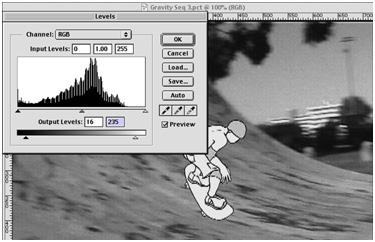
Television also has a problem with peak whites and super blacks. To do things properly, you should also adjust your levels so that your black actually occurs at 16 and your white peaks at 235.
RECTANGULAR PIXELS
DVD's display pictures in one of four different ways -
- PAL 4:3
- - The standard definition screen size used in Australia and Europe
- PAL 16:9
- - The widescreen format used in Australia and Europe
- NTSC 4:3
- - The standard definition screen size used in America and Japan
- NTSC 16:9
- - The widescreen format used in America and Japan
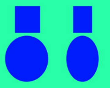
A DVD can display images at an aspect ratio of 4 by 3 or at a widescreen ratio of 16 by 9. In actual fact, both images are stored on the disc as frames of 720 pixels by 576 (or 720 by 480 for NTSC discs). Thus even though DVD's can be set to wide screen mode, they don't actually store high definition pictures. HDTV is only available with digital video broadcasts and a set top box receiver.
If you divide 576 by 720 you actually get a ratio of 5 by 4! Don't be confused by this. The visible size of a television screen is actually 4 by 3 because television pixels are not square, they are rectangular. Thus if a standard TV set is 30cm high, it will be 40cm wide. If it's 6 metres high, it'll be 8 metres wide, and so on. In effect, this means that your 720 by 576 computer file will be stretched horizontally.
To transfer computer generated images (square pixels) to video (rectangular pixels), you should create them at 768 by 576 pixels, then resize them to 720 by 576. For many situations the difference is quite difficult to see, so only do this if you are a perfectionist or your art work deals with geometric shapes.
Wide screen DVD's work in the same way, although in this case the video is stretched out even further. By using an anamorphic lens, it is possible to use a standard DV camera, and have each 16:9 picture stored as a squished up 720 by 576 image on the DV cassette. In the same way, when you design graphics for a 16:9 project, you should create them at 1024 by 576 pixels and the resize them to 720 by 576.
Because we're talking about absolute pixel sizes here, it should make no difference what DPI setting you use. The number of dots per inch will depend on the size of the screen, not your settings. However having said that, for reasons of their own, Apple have decided that DVD Studio Pro will scale PICT files, so in practice you actually need to set your image to 72 dpi.
By the time you've blurred your work of art, reduced its colour depth, decreased its contrast and squashed it to allow for rectangular pixels, you might be suspecting that all this advice was some terrible joke! However, its how the image appears on a television screen that matters, and that's where you'll see that the picture has actually improved.
INSTANT DVD MENU
One of the easiest ways to create a menu for a DVD is to simply take a pertinent screen grab from the video, and add some basic text over it.
- Use your editing package to locate the video frame you want
- Choose "export still picture" and save it
- Open the image in PhotoShop (it'll already be the right dimensions)
- Apply an interlace filter if necessary
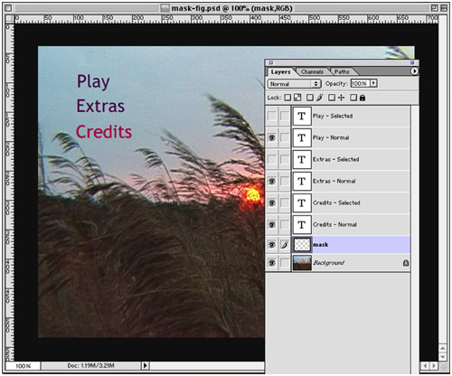
- Using a new layer for each, create your normal and selected button states (see figure 1)
- Import your menu into DVD Studio Pro and set the button states
The author has made every effort to confirm the accuracy of the information in this article, however, it is his opinion only and comes with no guarantees. Please consult your family technologist if in doubt.